

Table of Contents
Introduction To Storytelling with Data Visualizations
In this article, we are discussing The Art of Storytelling with Data Visualizations. The big data revolution is no more a fad. We are only at the tip of the iceberg when it comes to tapping data that will make an impact on business profits and generating valuable insights. In the US alone, it is estimated that 4.4 Petabyte (4,416,720 GB) of data is being used every 60 seconds!
With big data, comes big responsibilities (yeah, I said it). It has now become essential to zero in on portraying the big data in order to aid business stakeholders and end-users. Granted that analyzing data and making complex machine learning models is a highly sought-after skill of this decade. But the ability to extract value from it, to be able to visualize and most importantly communicate also carries equal weight. That’s where your skills as a narrator and storyteller come into the picture.
“Numbers have an important story to tell. They rely on you to give them a clear and convincing voice.”
Stephen Few
Importance in organizations
Storytelling with Data Visualizations, Stories have always been a primary means of igniting thoughts and provoking actions both in personal and professional lives. Previously overlooked by enterprises, the need for data visualizations across all domains has only recently gained momentum. Even the charts you have created in MS-Excel to perk up your boring report counts!
- Aids stakeholders to better understand the value addition of the model
- Increases recollection: we are more inclined to remember visual graphs than a many paged report.
- Charts and graphical reports easily achieve the result of communicating information that is valuable and understandable for the organization. No matter how profound or vital a data scientist’s analysis may be, a decision-maker will not be able to understand the logic behind it without inquisitive visuals to make it interesting. This point of view is based on the flawed assumption that business decisions are based solely on logic and reason.
- With the enormous amount of data being collected and stored every minute, it is bound to get more complex and a lot of it can be overlooked, Data visualization act as a universal means of attaining information. No one needs to be trained to gain insights from visuals.

5. It also helps businesses to dig into –
Widget not in any sidebars
- Correlations and patterns in Data: Data Visualizations help in finding and understanding correlations between different aspects and features within the dataset. This holds immense importance in decision-making. For example, to find whether increasing campaign ads attributed to an increase in sales.


- Visualizing trends: Line graphs and scatter plots are best suited for observing time-series data. This helps in determining trends or certain benchmarks that may affect an organization.


How to appeal the audience with your newly acquired analysis?
Simply applying the a machine learning model that provides best performance or finding meaningful patterns and anomalies in data isn’t enough. To make your newly acquired insights crystal clear to your audience, you must keep in mind these three factors –
memorable, ability to take in the picture, relevance
- Make your story memorable: Our brains are hardwired to process visuals faster than plain numbers. Being able to “see” the data in a creative manner makes it much easier to comprehend and retain. Remember when I mentioned somewhere above how much data is used every minute? You don’t, right? Now, look at this interesting pictogram by Forbes.


- This picture makes you visualize through known and famous applications, how much data is used every minute. Did atlease some of this now stick to your head? A study by Stanford professor Chip Heath found 63% could remember stories, but only 5% could remember a statistic. Stories are what catch people’s attention.
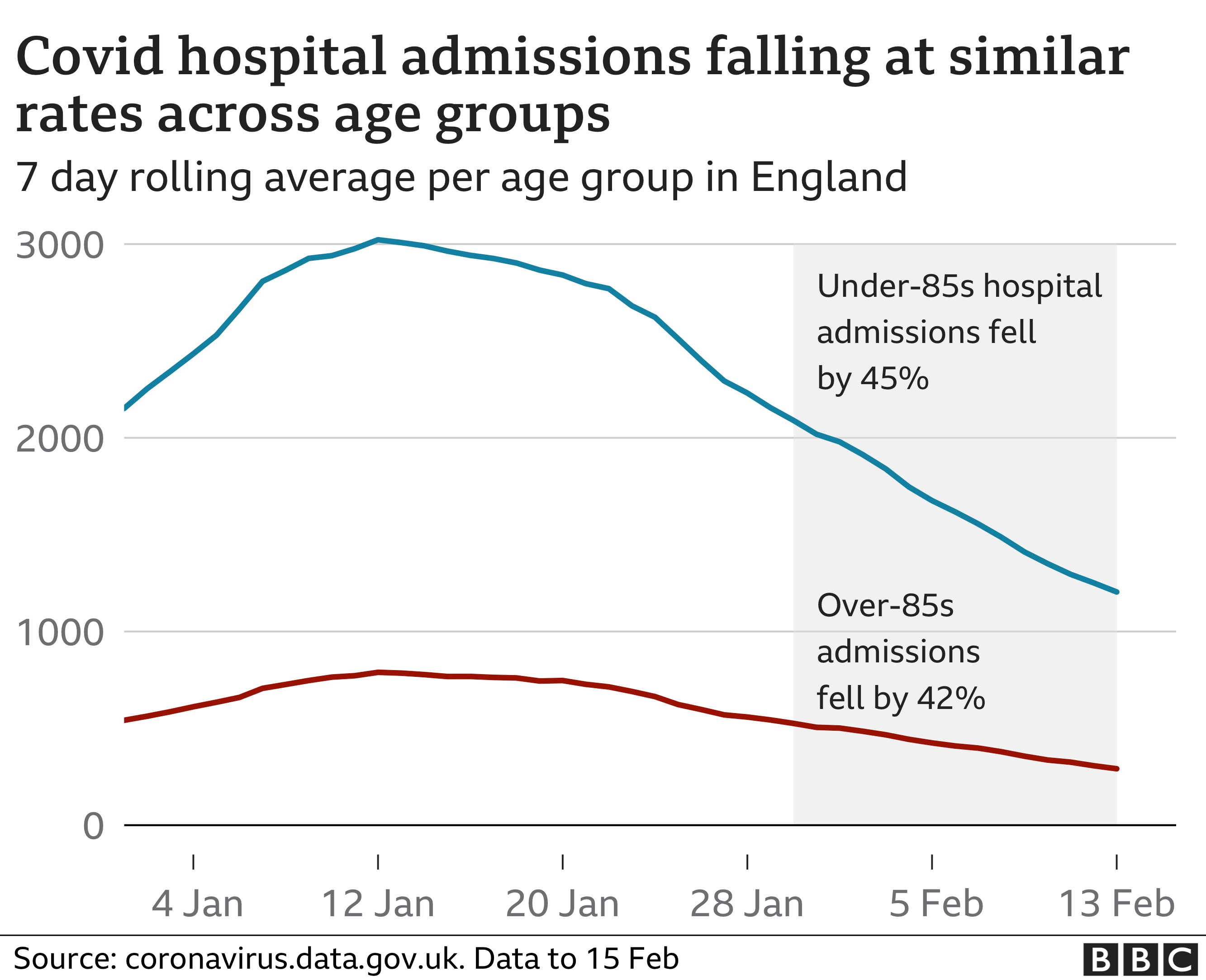
- Credibility: In a world full of increasing fake news and misleading content, people demand cold, hard facts. They want persuasive numbers that anchor claims to reality. But just statistics by itself can be incredibly boring. For example, a lot of these days are skeptical about getting the COVID-19 since it does not ensure complete protection from the pandemic, and due to accelerated roll-outs and limited testing. But the below graph shows how the vaccine has helped in England, which is a compelling story.

- Context is King: When presenting data through stories, the audience needs to be completely engaged. This can only be achieved if the story being presented has some relevance to them. A Spotify Account holder has no business in wanting to know the companies profit margins or marketing strategies. If you’ve ever used Spotify however, you must have noticed that towards the end of the year, they release something called “202x Wrapped”. This helps customers have a sense of belonging with the popular streaming application. It also helps you gain insights into what you’ve streamed throughout the year.


Steps to follow for a perfect data narrative
1. Set up the story
Begin with a question or a problem to solve. Think about the data you will need to answer the question. Figure out what the audience will gain from the problem you seek to mitigate.
2. Know your audience
The people who are to gain insights from your visualizations should steer all your decisions in making charts and graphs. You should be aware of:
- The knowledge they already possess
- What they are to gain with your visualizations
- The type of decisions your audience will make based on your insights. Or in simpler words, how they react to it.
3. Narrate a compelling story
As we have already discussed and witnessed, people remember stories and pictures, not mundane statistics. Take them on a journey with your data visuals. Make sure every member of your audience is intrigued and has gained the knowledge you wanted to portray.
4. More visuals, less text
“Visuals speak louder than words” should be your new mantra. Your audience understands metrics, trends, and patterns better when portrayed through graphs, not a 40-page report. Only use words and labels to add sense to your graphs. Minimize the use of text as much as possible.
5. Offer clarity
Business analysts can do a lot with the raw data they’re given. Huger the volume of data in terms of features, the more inferences generated. However, make sure you’re crisp and concise with the story you weave out of the data.
6. Compare with previous trends
A lot of results are also more insightful if they can be compared. Compare it to the company’s own benchmarks, past performance, or even the performance of a competing business. Whatever you do, make sure your comparison has some context.
7. End with a bang
There is no ideal number of graphs or charts that can make your story compelling. If your story isn’t delivering any information, then it isn’t worth narrating. Make sure you have answered the right questions.
Widget not in any sidebars
Best practices in Storytelling with Data Visualizations
- Make labeling the axes and giving titles your cardinal rule in plotting charts.
- Use color shades that are easy on the eye. There are also fixed color palettes available online at your disposal.
Serious vs playful colors


- Construct reference labels for each hue in stacked histograms and multiple bar graphs.


- Select the right chart.

- For continuous and time-series data, point visualizations are an absolute no-go.
- Know your audience before creating visualizations. There’s unquestionably a difference between insights a decision-maker demands compared to what a layman wants to see.
- Make sure that you mark pivotal points in graphs if significant.
- Lastly, don’t forget to Keep it Simple!


Conclusion
The Art of Storytelling with Data Visualizations is Storytelling with data. It has become more and more relevant in modern times where everyone is looking for quick fixes. Human brains cannot tolerate absorbing too much information and data. Graphs and dashboards are essential in delivering helpful insights and information. It also bridges the gap between a data scientist and a decision-maker. Thus data analysts should not only focus on generating highly effective results, but also deliver good data visualizations.

 Data Science Interview Questions and Answers")

 Data Science Interview Questions and Answers")
 Data Science Interview Questions")

