

Table of Contents
Beginner’s Guide to Learning Power BI
This article is all about Beginner’s Guide to Learning Power BI. Data visualization has become one of the most important skills for a data analyst to have. The graphical representation of data and statistics helps decision-makers grasp insights in a meaningful manner. In such a market where the importance of data visualization has only risen, there also exists an array of Dataviz tools.
Power BI is one such business analytics tool developed by Microsoft in 2014. It consists of features that provide interactive visuals and business intelligence (that’s what the BI stands for) capabilities. Power BI tool is beginner-friendly and enables users to easily create reports and dashboards. In addition to this, Power BI supports automatic refresh of already-stored data to facilitate regular analysis tasks such as internal business reports. It is very popular among non-technical users who need to aggregate, visualize, analyze and collaborate their findings.
Let’s learn about some features of Power BI that makes it one of the most widely used DataViz tools across industries.
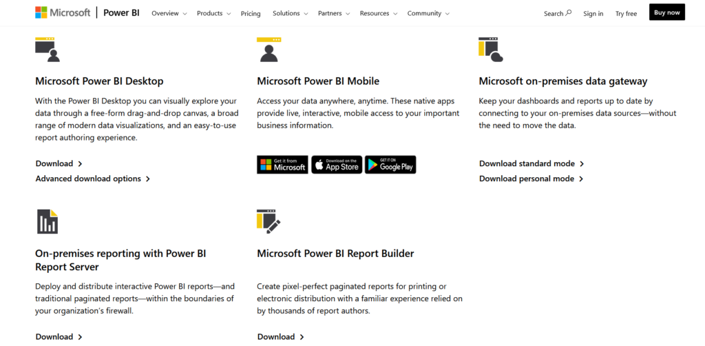
Power BI Products
When we view the Power BI Downloads page, we see multiple choices to choose from. Before we move on to installation, we must understand the array of products Power BI has developed.
- Power BI Desktop – Most widely used tool by beginners. It provides drag-and-drop functionality, a wide range of charts, and the ability to make creative dashboards.
- Power BI Mobile – This provides live access to data and important business insights on your mobile application. Using Power BI mobile apps, one can stay connected with data on Windows, iOS as well as Android devices.
- Microsoft on-premises data Gateway − This enables organizations to keep data fresh by connecting to on-premises data sources.
Data Management
Power BI provides a solid foundation for abstracting data from different kinds of sources. It also has features to model data by creating relationships among different tables. This is essential for the business understanding of data from disparate sources.
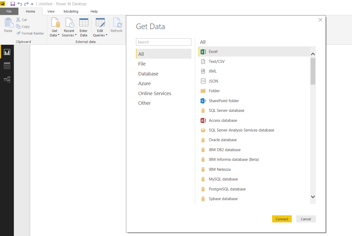
Supported Data Sources
Power BI has built-in connectors to extract data from a wide array of services and databases. With the help of the ‘Get Data’ feature, we can load data for the necessary report generation in a matter of minutes. The kinds of data sources can be divided into four categories –
| File Type | Database | Azure | Online Services and Other |
| These include commonly used data sources like Excel sheets, XML files, and data from CSV sources. – Excel, Text/CSV – JSON, Folder – XML | Different industries use different database servers to serve their data storage and manipulation purposes. Power BI provides functionality for – – Access Database – SQL Server, MySQL, PostgreSQL – Oracle, IBM DB2 | Azure is Microsoft’s own cloud service that facilitates building, testing, deploying, and managing applications and interfaces on Microsoft-managed data servers. Thus, Power BI provides support for – – SQL Azure Database – Azure Marketplace – Azure HD Insight Spark and many more… | Power BI also has the ability to extract data from the web and other third-party applications. These include – – Google Analytics, SalesForce – GitHub, MailChimp – Internet, Hadoop, Spark, etc. |
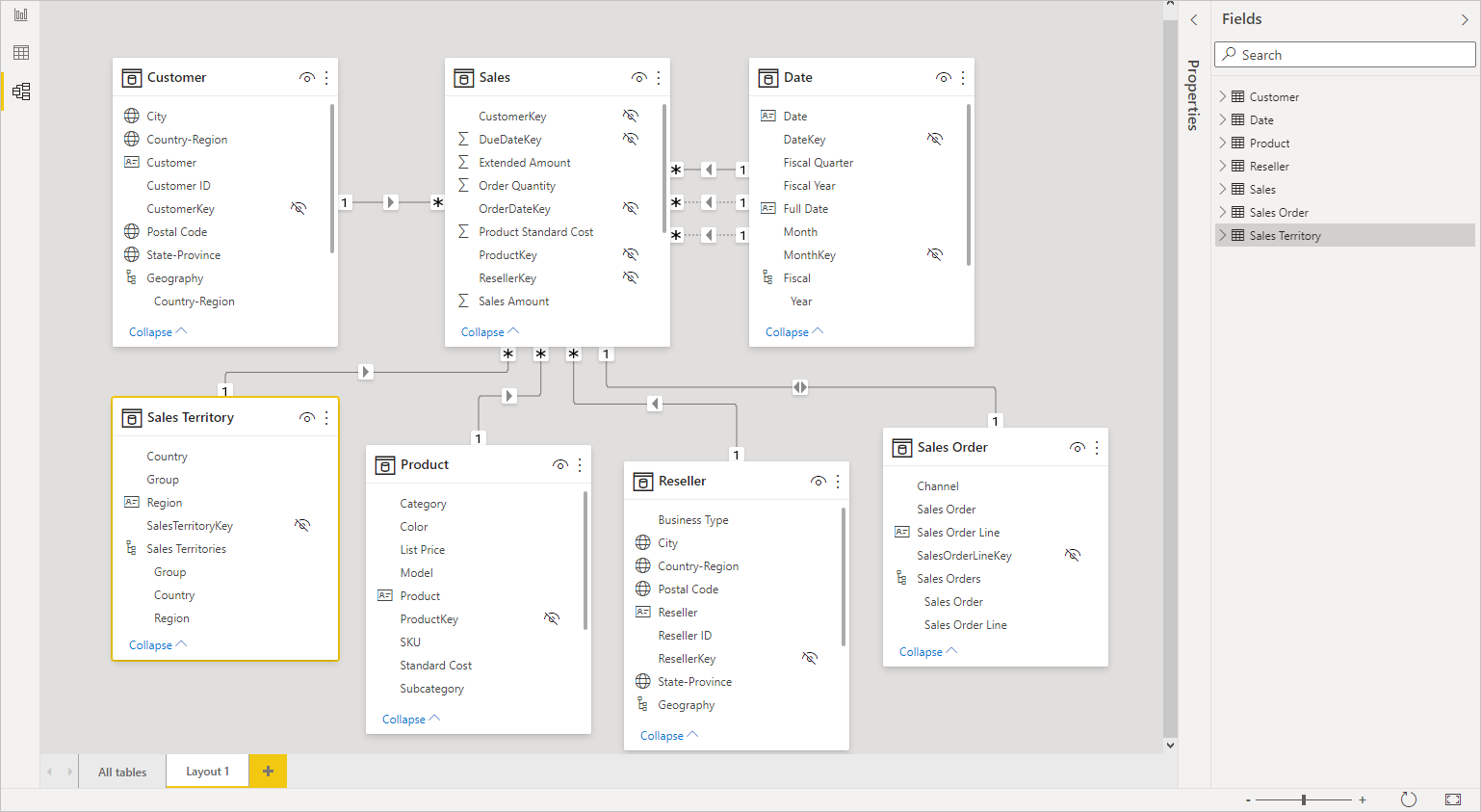
Data Modeling
Data Modeling in Power BI is used to connect multiple data sources and databases. This is done to form relationships among disparate data sources. Relationships aid in understanding the data to a deeper extent and to create better visualizations.
Things to note –
- Data modeling connects data from different tables that have common columns.
- If the column heading is the same across tables, Power BI will auto-detect the relationship.
- We can also perform joins on data using data modeling.
- Data modeling also helps in the creation of calculated columns and tables using DAX (more about it further down the article).
Visualizations in Power BI
As we have already discussed, visualizations serve as a means to effectively present data and insights. Power BI offers a wide range of plots and graphs to facilitate data visualization. In addition, charts can be created by dragging and dropping the required fields on the respective visual and value axes.
Some popularly used graphs in Power BI include –
| Type | Appearance | Description |
| Area Chart | 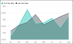 | Area charts represent the variations in one or more quantities over time. It works like an extension to Line Charts. |
| Bar Graph | 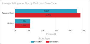 | Bar graphs are useful to visualize specific values across different categories of an attribute. |
| Combo Charts |  | It works as a combination of line charts and bar graphs. It has two variations – 1. Line and Stacked Column 2. Line and Clustered Column |
| Gauge Chart | 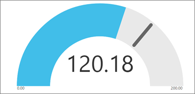 | Gauge charts are formed from a circular arc. It measures a single value’s progress towards a specified goal. |
| Doughnut Chart | 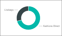 | Doughnut charts are fancy-looking pie charts. Like pie charts, they represent the distribution of parts in a whole. The center is blank to allow space for a logo or icon. |
| Funnel Chart | 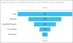 | Funnel charts are essential to quantify a process by breaking them into items and stages. They are implemented on sequential processes. |
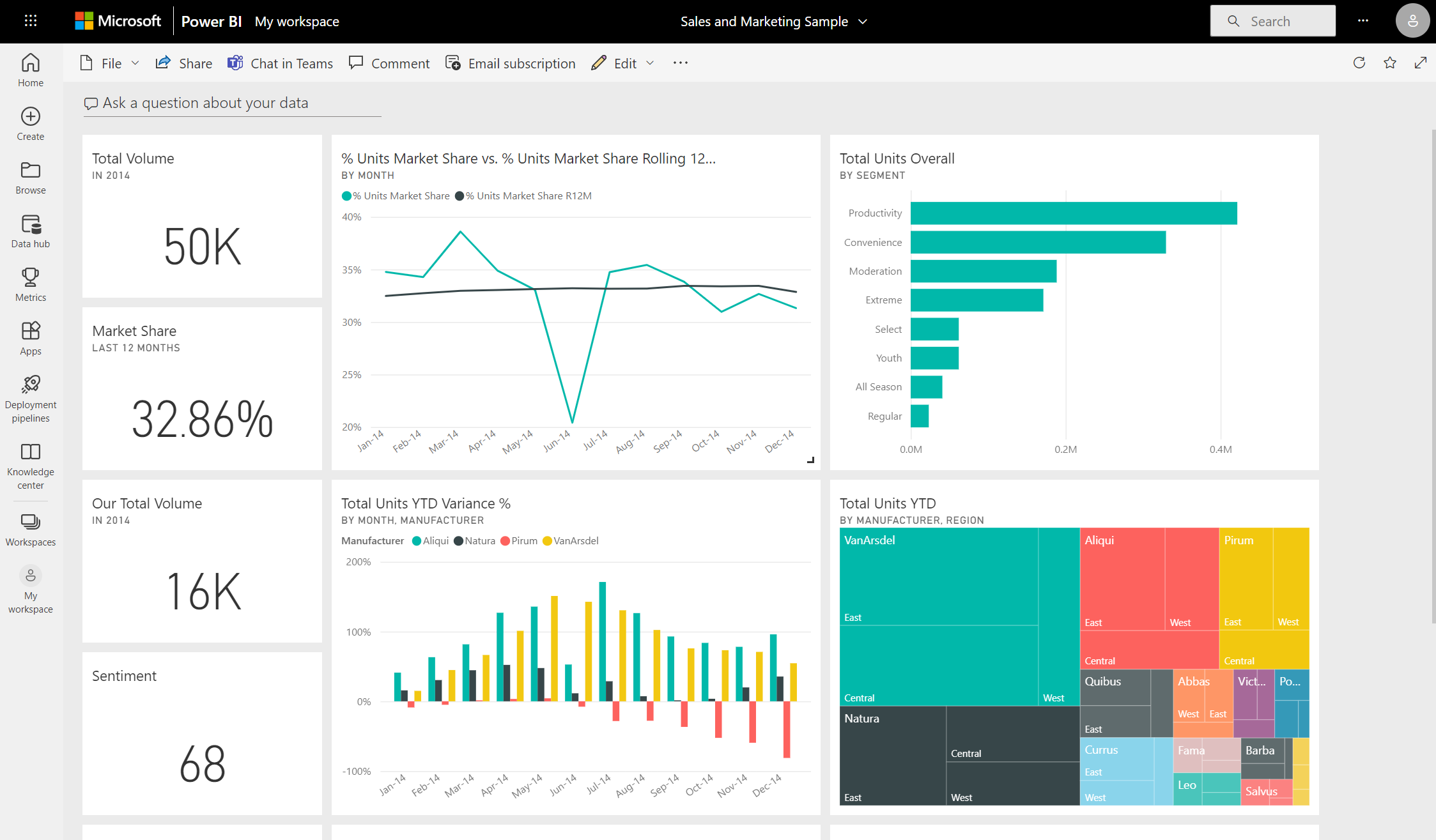
Dashboards in Power BI
A Power BI Dashboard consists of graphical elements on a single page called ’tiles’. The dashboard as a whole tells a story about data. Since it is restricted to one page, analysts need to be choosy about what graphs and charts end up on the dashboards. It is also often referred to as a ‘Canvas’.
Interesting things to note –
- A single dashboard can contain data from multiple sources.
- They aid in monitoring businesses and visualizing important metrics at a glance.
- They are also highly interactive and have the ability to update periodically based on real-world data.
- It can combine on-premises and cloud data.
- Tiles from one dashboard can be used in another.
- Dashboards also enable collaboration and sharing of data in an organization.
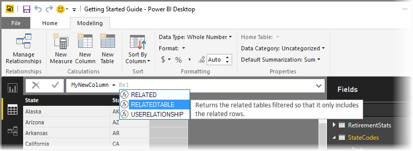
DAX in Power BI
DAX stands for Data Analysis Expression. They are nothing but expressions and formulas that are applied for data manipulation and calculations. These expressions are a combination of functions, operators, and constants that are fed into one formula to yield results. DAX is incredibly useful in Power BI as they help analysts utilize and transform data. Additionally, we can execute queries for data selection and manipulation to use it to its full potential.
Following are some of the features and functions of DAX in Power BI –
Formula
DAX formulas are created for calculating columns and measures. They can be simple or quite complex as well. DAX provides some built-in functions in Power BI that can be accessed in the formula tab using the auto-complete feature. Formulas begin with the ‘=’ sign. Once you have used the built-in function or typed in your own, press ENTER to implement it.
Calculated Columns
A calculated column is an attribute to add to an existing table (using data modeling). This is done by creating a DAX formula that defines the column’s values.
Calculated Tables
This is a computed object, based on a formula expression. It is derived from all or part of other tables in the same model. Calculated tables are also used in place of querying and loading values into your new table’s columns from a data source. They enable relationships with other tables as well.
Summary
Here are some of the pros Power BI offers that should make it your first choice as a DataViz tool in 2021. In addition to that, if you aspire to be a Business Analyst, make sure you learn about some fundamentals and work on some data using Power BI. This is the summary of Beginner’s Guide to Learning Power BI.
- Widely used by industry leaders as a powerful business intelligence tool.
- Ensures data security
- Offers enterprise analytics that can be synced with real time data
- Azure facilitates big data visualizations
- Make efficient reports and interactive dashboards.
- Integrate your data from popularly used platforms like Excel, SQL etc.


